Some of the latest iPhone and Android releases have introduced screens that cover the entire face of the device, except for a small notch.
This notch can cause some interesting design challenges.
WebKit, the web browser engine used by Safari has provided recommendations for designing on these devices.
This post will demonstrate how to implement those recommendations in a React application using Material-UI.
Using the Whole Screen
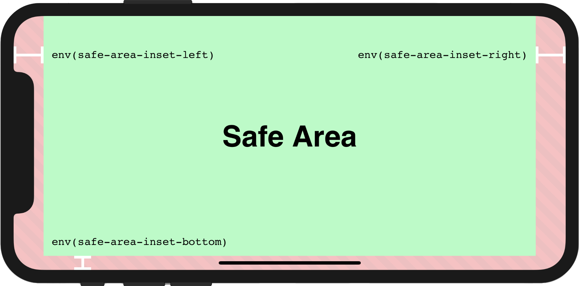
To deal with these types of screens, the notion of a safe area has been added to CSS and it is implemented through a set of four CSS environment variables, as shown in the image below.
First, in order to use the entire screen on the device viewport-fit must be set to cover.
<meta name='viewport' content='initial-scale=1, viewport-fit=cover'>The safe areas must be respected by applying padding using the env() CSS function and the four pre-defined environment variables safe-area-inset-left, safe-area-inset-right, safe-area-inset-top, and safe-area-inset-bottom.

App Bar
The Material-UI AppBar component which is used to display information and actions relating to the current screen gets obstructed by the notch.
The Fix:
The App bar touches the left, right and top edge of the screen, so apply padding to each edge.
import AppBar from '@material-ui/core/AppBar';
import { makeStyles } from '@material-ui/core/styles';

const useStyles = makeStyles(theme => ({
    appBar: {
        paddingTop: `env(safe-area-inset-top)`,
        paddingLeft: `env(safe-area-inset-left)`,
        paddingRight: `env(safe-area-inset-right)`
    },
}));

export default function TopNav(props) {
  const classes = useStyles();
  return (
    <AppBar
      className={classes.appBar}
      ...
    >
      ...
    </AppBar>
  )
}

Drawer
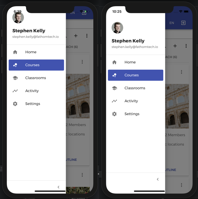
Next, the Material-UI Drawer component which is used to navigate to different areas of an app is too close to the notch area.
The Fix:
The Drawer touches the top, bottom and left edge of the screen, so apply padding to each edge. This is applied to the `paper` component inside the Drawer using the `classes` prop.
import Drawer from '@material-ui/core/Drawer';
import { makeStyles } from '@material-ui/core/styles';

const useStyles = makeStyles(theme => ({
    drawerPaper: {
      paddingTop: `env(safe-area-inset-top)`,
      paddingBottom: `env(safe-area-inset-bottom)`,
      paddingLeft: `env(safe-area-inset-left)`
    }
}));

export default function SideNav(props) {
  const classes = useStyles();
  return (
    <Drawer
      classes={{
        paper: classes.drawerPaper,
      }}
      ...
    >
      ...
    </Drawer>
  )
}

Full Screen Dialog
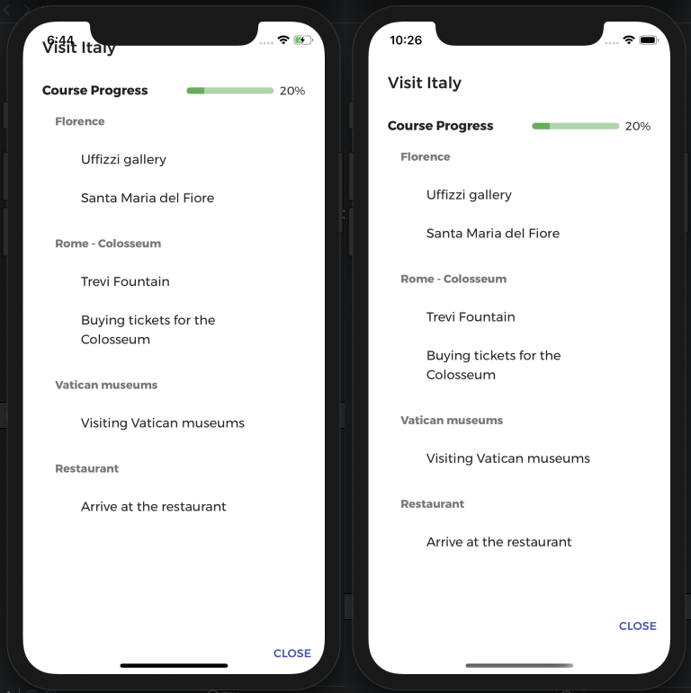
The Full Screen Dialog component fills the entire screen, containing information and actions. It becomes obstructed by the notch.
The Fix:
The Full Screen Dialog touches all four edges of the screen and so again we apply padding to each edge. This is applied to the `paper` component inside the Dialog using the `classes` prop.
import Dialog from '@material-ui/core/Dialog';
import { makeStyles } from '@material-ui/core/styles';

const useStyles = makeStyles(() => ({
    paper: {
        paddingTop: `env(safe-area-inset-top)`,
        paddingBottom: `env(safe-area-inset-bottom)`,
        paddingLeft: `env(safe-area-inset-left)`,
        paddingRight: `env(safe-area-inset-right)`,
    }
}));

export default function FullScreenDialog(props) {
  const classes = useStyles();
  return (
    <Dialog
      classes={{
        paper: classes.paper,
      }}
      ...
    >
      ...
    </Dialog>
  )
}

Conclusion
Devices with various notches or cutouts will need to be taken into consideration when designing websites for the next number of years. Hopefully this post has helped illustrate some of the potential design issues and ways to overcome them.
