
Machine Learning is becoming a bigger and bigger part of industries around the globe. With the advent of self-driving cars, voice assistants and facial recognition, many companies are left wondering “Where would my developers even start?”. Well, with Machine Learning, it’s all about the data!
Prerequisites
Before we can begin, there’s a few things you need:
Python - Python and R dominate the machine learning world, partially because Python is very easy to understand but also because they’re both brilliant at data manipulation. Presenting your data in the right way is the difference between a model that works and a model that doesn’t. For this guide, you’ll need at least a well grounded understanding of Python syntax
Jupyter Notebooks - Sagemaker spins up a virtual machine that runs a Jupyter environment where you can manipulate your data and issue commands to train your model. You’ll need familiarity with notebooks and how to execute code using them. If you haven’t used Jupyter before, we’ve written a blog post on that.
AWS Account - You need to sign up and have an active AWS account which can be done here.
Use Case
For this guide, we’re going to be using an AWS example that deals with targeted direct marketing. An old direct marketing strategy might be “Let’s send out 20,000 letters to 20,000 people and see who responds, those will be our customers!” but now with the power of machine learning, you can analyse demographics, past interactions and environmental factors and apply a new strategy of “20,000 people live in this area, but our ML model predicts these 5000 specific people have a 95% chance of subscribing when contacted. Let’s just send letters to them” and in the process save time, effort, money and trees.
Setup
In order to begin training our model, we’ll need two things - an S3 bucket and a jupyter notebook instance.
S3 Bucket
This is somewhere we can put the data we’re going to process for training, validation and testing. So go into the AWS S3 service and create a bucket. If you’re struggling, check out this guide. Remember your bucket name - we’ll need to reference it later!
Jupyter Notebook
Here’s where Sagemaker comes in. Navigate to the AWS Sagemaker service and click into Notebook Instances, then Create Notebook Instance, you should see a form which asks you for certain information to define your Jupyter notebook:
Notebook instance name - Just a reference name for your instance, I’m calling mine 03-03-2020-direct-marketing
Notebook instance type - This is the type of EC2 instance that is going to run your notebook. If you have no experience with EC2 before, these types are a way of defining the kind of cloud computing resources your notebook has access to (not for training, just for the notebook itself) and the cost of said resources. Leaving it as the default is fine.
Elastic Inference - A way of speeding up your instance throughput and decreasing latency. It’s not needed so leave as the default none.
IAM Role - Down at Permissions & Encryption you’ll be asked to assign an IAM role to your instance. This role will be used to access our S3 bucket so we will have to define an access policy for that, the easiest way is to select Create a new role and enter in your S3 bucket name when prompted. Then click Create Role!
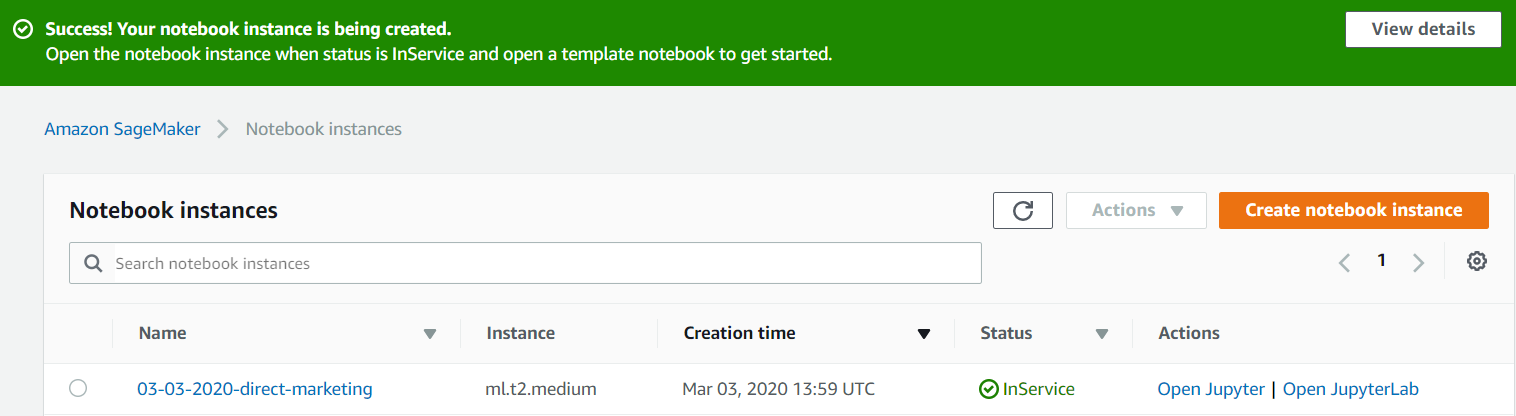
All the other options can be left as default. Go ahead and click “Create notebook instance”. It may take a few minutes for your Notebook instance to be spun up so don’t worry, waiting is perfectly normal. Once the instance is ready, click Open Jupyter, make a conda_python3 notebook and give it a name.
Importing Our Dataset
One of the most important things to understand about machine learning is that good data is like gold - extremely valuable and ideally found in high quantities. In order to do that we need to import the data contained in our S3 bucket. To withdraw this data, our notebook needs to assume our IAM role and get our S3 bucket reference by running the following code:
# Set the bucket name and a directory prefix where we're going to store our files
bucket = '<your_s3_bucket_name_here>'
prefix = 'sagemaker/direct-marketing-demo'

# Assume our IAM role
import boto3
import re
from sagemaker import get_execution_role

role = get_execution_role()
We’re also going to need a lot of python libraries in this guide, each one is explained below. Some of these may not be needed for this guide but will be needed for our next blog post on training your model using XGBoost:
import numpy as np                                # For matrix operations and numerical processing
import pandas as pd                               # For munging tabular data
import matplotlib.pyplot as plt                   # For charts and visualizations
from IPython.display import Image                 # For displaying images in the notebook
from IPython.display import display               # For displaying outputs in the notebook
from time import gmtime, strftime                 # For labeling SageMaker models, endpoints, etc.
import sys                                        # For writing outputs to notebook
import math                                       # For ceiling function
import json                                       # For parsing hosting outputs
import os                                         # For manipulating filepath names
import sagemaker                                  # Amazon SageMaker's Python SDK provides many helper functions
from sagemaker.predictor import csv_serializer    # Converts strings for HTTP POST requests on inference
We’re using a dataset provided by AWS about the customers of a bank. And rather than go through S3, we can use Unix shell commands right in the notebook to download the files into our instance and unzip them:
!wget https://sagemaker-sample-data-us-west-2.s3-us-west-2.amazonaws.com/autopilot/direct_marketing/bank-additional.zip
!unzip -o bank-additional.zip
Now we have the data and can begin to investigate the relationships each feature of the data has with every other feature and manipulate the data to our ends.
Data Visualisation
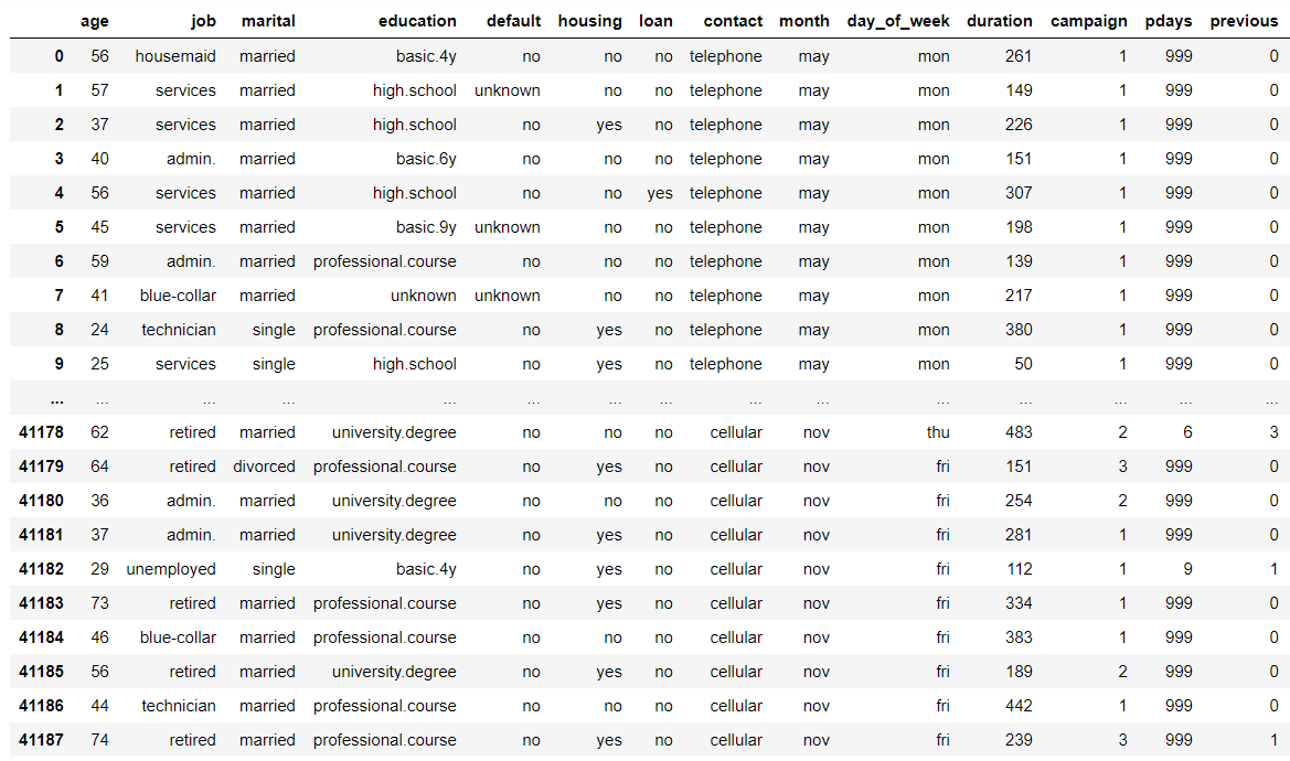
For a quick check of how much data we have, we can use data.shape() but let’s have a closer look at the first 20 rows of data and see what we can glean:
data = pd.read_csv('./bank-additional/bank-additional-full.csv')
pd.set_option('display.max_columns', 500)     # Make sure we can see all of the columns
pd.set_option('display.max_rows', 20)         # Keep the output on one page
data
Before we go any further there’s a bit of data engineering terminology we might cover first - features. A feature is simply a quantifiable property or characteristic of something. For example, in a dataset on cars, our features would include colour, price, engine size, owner name, brand, model, etc.
To explain some of the more confusing features:
default: Has credit in default? (categorical: ’no’, ‘unknown’, …)
housing: Has housing loan? (categorical: ’no’, ‘yes’, …)
loan: Has personal loan? (categorical: ’no’, ‘yes’, …)
campaign: Number of contacts performed during this campaign and for this client (numeric, includes last contact)
pdays: Number of days that passed by after the client was last contacted from a previous campaign (numeric)
previous: Number of contacts performed before this campaign and for this client (numeric)
poutcome: Outcome of the previous marketing campaign (categorical: ’nonexistent’,‘success’, …)
emp.var.rate: Employment variation rate - quarterly indicator (numeric)
cons.price.idx: Consumer price index - monthly indicator (numeric)
cons.conf.idx: Consumer confidence index - monthly indicator (numeric)
euribor3m: Euribor 3 month rate - daily indicator (numeric)
nr.employed: Number of employees - quarterly indicator (numeric)
y: Has the client subscribed a term deposit? (binary: ‘yes’,’no’)
So what can we tell about the data? A couple of very important things:
- There’s a bit more than forty thousand customer records, and 20 features (columns) for each customer. This is a sizeable dataset and when training a machine learning model, the more data the better. We’re not going to feed all our data into this model, we’ll prune it first, but always better to start with more than less.
- The features are mixed; some numeric, some categorical - this is important for the algorithm (XGBoost) we’ll be using which has some restrictions as regards the feature types it allows.
- The data appears to be sorted, at least by day of the week and contact - all the contact types are grouped together. This is important because if we just train our model on the first half of the data it may not know about feature types that only occur later on in the dataset. This is where randomising and shuffling data becomes important.
- The features are all relevant to our purpose, but will we actually have them when we need to make a new prediction - our role here is to create a model that predicts if a customer will subscribe to a term deposit and every feature listed in the dataset is possibly relevant to that prediction. In the real world, datasets are rarely so perfect, and some features might not make the cut. For example, a person’s name or phone number would have no impact whether or not they will subscribe to a term deposit. Or in our case - when our model is deployed and the bank is using it to screen customers for direct marketing, will we have access to all their economic data? Doubtful. So our model shouldn’t rely on it. We’ll need to take out features like
emp.var.rate,cons.price.idxand others later.
A More In-Depth Look
Let’s have a more in depth look at the data to get a better understanding of what we’re dealing with:
# Frequency tables for each categorical feature - how frequently does each feature value appear
for column in data.select_dtypes(include=['object']).columns:
    display(pd.crosstab(index=data[column], columns='% observations', normalize='columns'))

# Histograms for each numeric feature
display(data.describe())
%matplotlib inline
hist = data.hist(bins=30, sharey=True, figsize=(10, 10))
You’ll now be faced with multiple tables. Starting from the top you should be able to see a frequency table for the job feature, see image below. From this we can see that 25% of the data collected was on people who work in administration and a further 22% in blue collar work. It’s important to know aspects of your dataset like this so that you begin to understand the limitations of the data or the biases it might have - for example, training a model specifically for retirees or students would work better with another dataset as they only make up 4% and 2% of the data respectively.
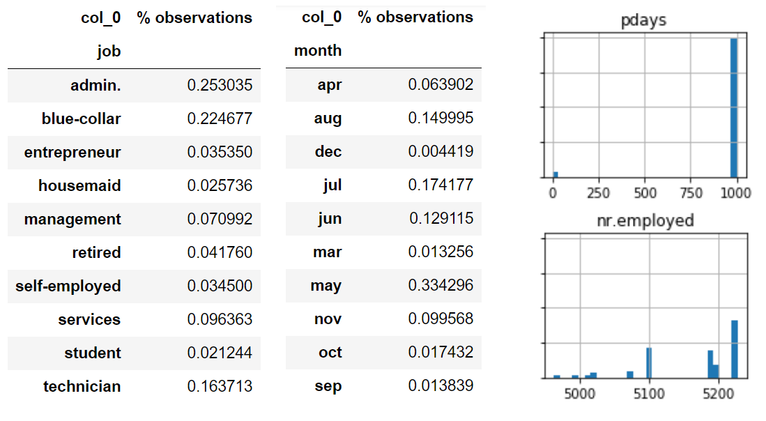
Further down we can see the histograms - these are used to show data distribution in a rough sense. This is another good tool for establishing biases in the data, we can see that the ages are fairly well distributed, most of the data is from the first campaign. A couple of more notable things from this view of the data: 1. Almost 90% of the values for our target variable y are no, so most customers did not subscribe to a term deposit. A few more notes:
- Many of the predictive features have categories with very few observations in them. If we find a small category to be highly predictive of our target outcome(y), we might not have enough evidence to make a generalization about that.
- Contact timing is particularly skewed as seen in the frequency table above. Almost a third in May and less than 1% in December. What does this mean for predicting our target variable next December?
- There are no missing values in our numeric features. Or missing values have already been imputed.
pdaystakes a value near 1000 for almost all customers. Likely a placeholder value signifying no previous contact.- Just by manually inspecting the data, several numeric features have a very long tail. Do they need to be so large?
- Several numeric features (particularly the macroeconomic ones like the unemployed feature) occur in distinct buckets. Should these be treated as categorical?
In Relation To Our Target
Let’s put these in the context of our target variable y and see if there are any strong predictors:
for column in data.select_dtypes(include=['object']).columns:
    if column != 'y':
        display(pd.crosstab(index=data[column], columns=data['y'], normalize='columns'))

for column in data.select_dtypes(exclude=['object']).columns:
    print(column)
    hist = data[[column, 'y']].hist(by='y', bins=30)
    plt.show()
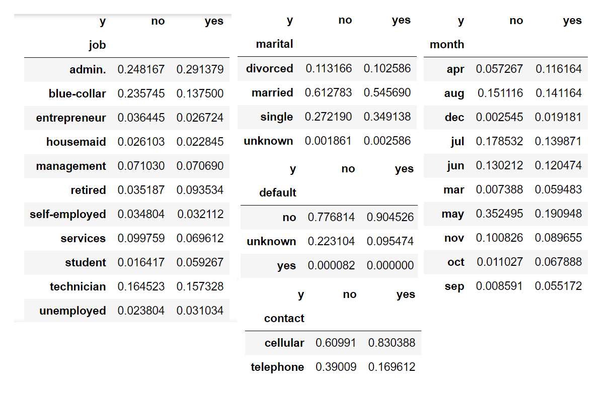
By looking at this data, we observe that people who are blue collar, married, have an unknown default status, contacted by telephone and/or during the month of May are far more likely to say no.
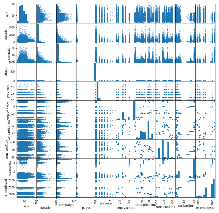
Scatter Plot
By placing our data in a scatter plot, we essentially compare each feature in our dataset to itself and we’re given an idea of how strong the correlation is between features. This only works for numeric features, hence why you won’t be seeing our target variable in this plot.
display(data.corr())
pd.plotting.scatter_matrix(data, figsize=(12, 12))
plt.show()
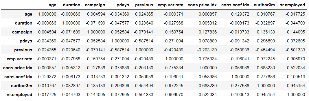
The table is a little hard to read because the numbers are quite long if there is a strong correlation between features there will be a high positive value in the table, ideally 1. Or, you can look at the scatter plot graphs directly to check the relationships where the stronger the correlation, the more the data points start to look like a line bisecting the graph. Unfortunately for us, in this case there’s no clear indicator of strong correlation between any of the features.
Data Cleanup
Every ML project has data that needs cleaning, in our case this means:
Handling missing values - If a data field is left blank, we need to fill it with a default option.
Converting all the categorical values to numeric values - this is for the XGBoost algorithm we’re using. It’s as simple as assigning each possible value a number - so for example, our target variable no becomes 0, yes becomes 1, etc. As a side note, with the XGBoost algorithm our target variable must start at 0.
Changing more complicated data types - things like images need to be prepared correctly to be fed into the model, or in our case we have numbers with unnecessarily long tails which we may want to simplify.
Eliminating variables with little or no reliable impact - As discussed previously duration, emp.var.rate, cons.price.idx, cons.conf.idx, euribor3m, nr.employed have no place in our predictions.
# If pdays is 999, simply state "no_previous_contact"
data['no_previous_contact'] = np.where(data['pdays'] == 999, 1, 0)
# Replace student, retired and unemployed with "not_working" to group those featuress together
data['not_working'] = np.where(np.in1d(data['job'], ['student', 'retired', 'unemployed']), 1, 0)
# Convert categorical variables to sets of indicators
model_data = pd.get_dummies(data)
# Eliminate useless features
model_data = model_data.drop(['duration', 'emp.var.rate', 'cons.price.idx', 'cons.conf.idx', 'euribor3m', 'nr.employed'], axis=1)
If you like, at this point you can go back and visualise your new dataset and see if any new insights can be gained using the methods above.
Splitting The Data
So, how do we train the model? Well, first we have to split our data into three subsets - a training set, a validation set and a test set. We split it for a very good reason - If we feed our model all our data when training it, how do we test to see if it works? If we feed the same training data in and get the same results, the model might just be remembering what we fed into it for training. It needs to be able to generalise!
To this end, we split the dataset into a training set (70% of the data) and a validation set (20%) so that for every round of training the model can test itself against the validation set and see how it does. This allows the model to go through several rounds of training, continualy improving with each attempt. Finally, when the model is done, we introduce data it’s never seen before - our test set (10% of the data). And how it performs with the test set can be a good indicator of how it performs out there in the real world. Here’s the split:
# Randomly sort the data then split out first 70%, second 20%, and last 10%
train_data, validation_data, test_data = np.split(model_data.sample(frac=1, random_state=1729), [int(0.7 * len(model_data)), int(0.9 * len(model_data))])
# Prep the training set for the XGBoost algorithm - the target variable must be the first column and store the dataset as a CSV
pd.concat([train_data['y_yes'], train_data.drop(['y_no', 'y_yes'], axis=1)], axis=1).to_csv('train.csv', index=False, header=False)
# Same as above for the validation set
pd.concat([validation_data['y_yes'], validation_data.drop(['y_no', 'y_yes'], axis=1)], axis=1).to_csv('validation.csv', index=False, header=False)
Now that our data is prepped for training we save it to the S3 bucket for our model to pick up:
boto3.Session().resource('s3').Bucket(bucket).Object(os.path.join(prefix, 'train/train.csv')).upload_file('train.csv')
boto3.Session().resource('s3').Bucket(bucket).Object(os.path.join(prefix, 'validation/validation.csv')).upload_file('validation.csv')
If you check your S3 bucket now, you should be able to see our training and validation files!
AWS Resource Cleanup
Don’t forget to clean up after yourself! This is especially true in the case of working with AWS because for the most part the services are pay as you go. This means that you could end up paying for ongoing services if you started them but never stopped them. So let’s make sure that doesn’t happen!
- Sagemaker - dashboard simply stop the notebook instance. You can then delete it if you want, but once stopped it won’t incur any costs.
- S3 - If you like, you can delete your S3 bucket but the costs are so minimal that you might want to keep the bucket just in case.
- IAM - Same as S3, an IAM is a free service so the only reason to delete the role we created is for tidiness.
Congratulations! Your data is now ready to be fed into a machine learning model and by completing this guide you’ve learned how to:
- Visualise data via pandas using tables, histograms, scatter plots and frequency tables.
- Clean up data by renaming, removing, transposing and conversion from categorical to numeric.
- Split data into training, validation and test sets and storing them in S3. In our next blog post, we’re going to show you how to train your model using the XGBoost algorithm and deploy the trained model as an endpoint!
If you found this blog post useful, you might be interested in our follow up that deals with training and deploying your XGBoost model.